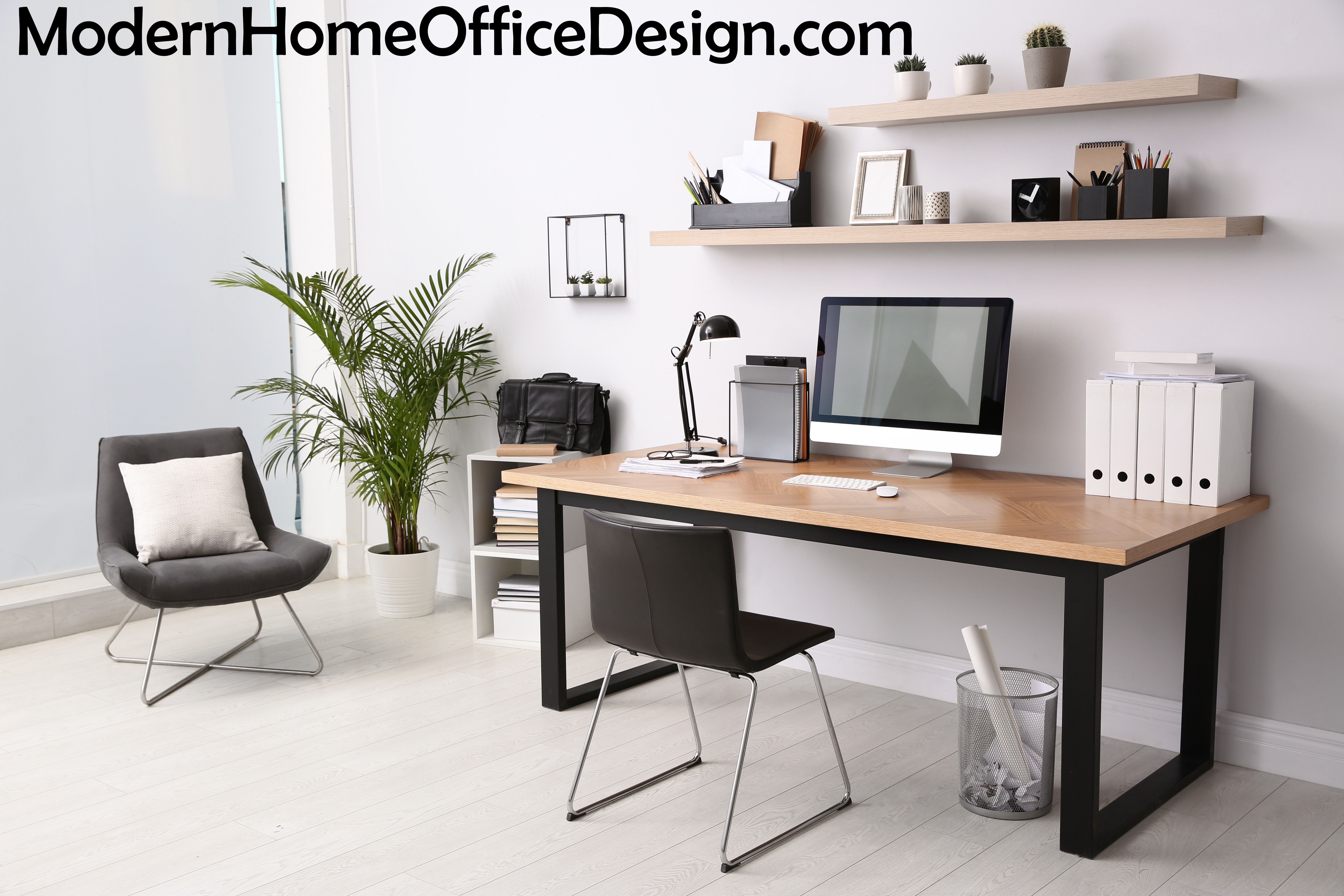
How To Fake “Authentic” Modern Home Office Design
The go-to style for personal workspaces is modern home office design. With its emphasis on form and function rather than excessive ornamentation, modern design seeks to reflect the true intended purpose of the space (interior and exterior) and its furnishings, including the materials from which the furnishings and products are made.
In general, modernism refers to the style of architecture and product design that developed during the period from about 1918 to 1970, in which a structure or product must exhibit three qualities: it must be solid, useful and beautiful. Those inherent qualities are what make modern design so timeless – and so suitable for workspaces.
Modern home office design, which also includes midcentury modern design, is a distinct aesthetic that values economy, simplicity and craftsmanship, as shown in its characteristic streamlined shapes, crisp lines, warm neutral colors and materials, and balance, often to the point of symmetry.
A common problem is that authentic modern design is expensive – think iconic pieces by Eames, Herman Miller, Philippe Starck, Noguchi, Florence Knoll or George Nelson– and even vintage and official reproductions are priced at levels that make them more likely to end up in the hands of collectors, museums and high-end commercial spaces than in a home office.
So, is it possible to get the look and feel of modern home office design on a real-world budget? Can your home office actually fake authentic modern design?
To a large degree, the answer is yes. Because modern office furnishings are so sleek and well designed, they’ve stood the test of time. As a result, ongoing demand for these classics has inspired manufacturers to produce similar styles at lower price points and in home-office-appropriate sizes.
The key to achieving visual “authenticity” is to mimic the hallmarks of modern design. Here are four underlying design traits to look for:
1. Keep it simple.
Modern home office design is characterized by bold, straight lines and streamlined shapes. Think sleek and spare, with open spaces and dramatic horizontal and vertical surfaces. The focus is on function, not adornment.
2. Make it natural.
Neutral, tactile materials and a warm, earthy color palette give modern design a sense of balanced comfort. Modern home office design often includes furnishings that mix glass, natural woods, leather, concrete or stone along with chrome or other metals. Structural elements are sometimes left exposed and materials untreated.
3. Keep it clean.
Clutter has no place in modern design. Storage areas can be built-in, wall-mounted, foldaway, pullout, in drawers or behind doors, but they absolutely must eliminate desk-mess. Choose storage components in colors and materials that contribute to a calm, cohesive design aesthetic.
4. Make it bold.
With its less-is-more, minimalist approach, it’s tempting to think of modern design as bland and dull. No way! Specifically, modern home office design regularly introduces black and/or primary colors as accents, used sparingly and strategically, to create an intense focal point. Consider a single piece of abstract art or a vibrant rug underfoot.
You may not be able to find or afford the genuine article, but if you keep these 4 easy guidelines in mind as you plan your workspace and select your furnishings, you can recreate the best of modern home office design without breaking the bank.


